
Motions
Summer.fi
Intro
As Summer.fi supports more protocols other than Maker, like Aave, Spark, and Morpho, there are more positions for users to choose from. Refinance encourages users to switch to a new position with a lower borrow rate or higher LTV, etc., within Summer.fi so that they don’t need to close a position in Summer.fi and go to other platforms to open a new one.
Objects
A straightforward swap positions flow
Prioritize crucial info while processing swap
People can easily select an appropriate position to refinance in a long list
Design
Iteration 1: Showing available refinance positions as cards
The first version was designed a long time ago. Summer.fi was still Oasis.app, and it only supported Maker protocol at the time. There were few positions to select, and we didn’t want to change the existing UI dramatically, so we adopted the two-column UI patterns in the Summer.fi (Oasis.app) to reduce the workload and time for development. It was put in a new tab called Refinace in the position management.
We chose cards to show the available positions with a simple title like 'High ETH multiple option' to help people select the best position to switch to .
However, this project was put on hold for a while because of product strategy changes.

The selected position is fixed to the top with a label
Iteration 2: Embracing Modal
Putting Refinance on a stand-alone page has the advantage of showing a lot of options and information, but it also distracts people from their current task. However, a modal window offers people a glance at this feature without leaving the current flow.

People can select a position and simulate it.

Iteration 3: 3 columns layout
We chose to use three columns layout because they can work as same as a linear timeline:
Current (left)
Change (middle)
Future (right)
It’s a very straightforward metaphor that people are familiar with.

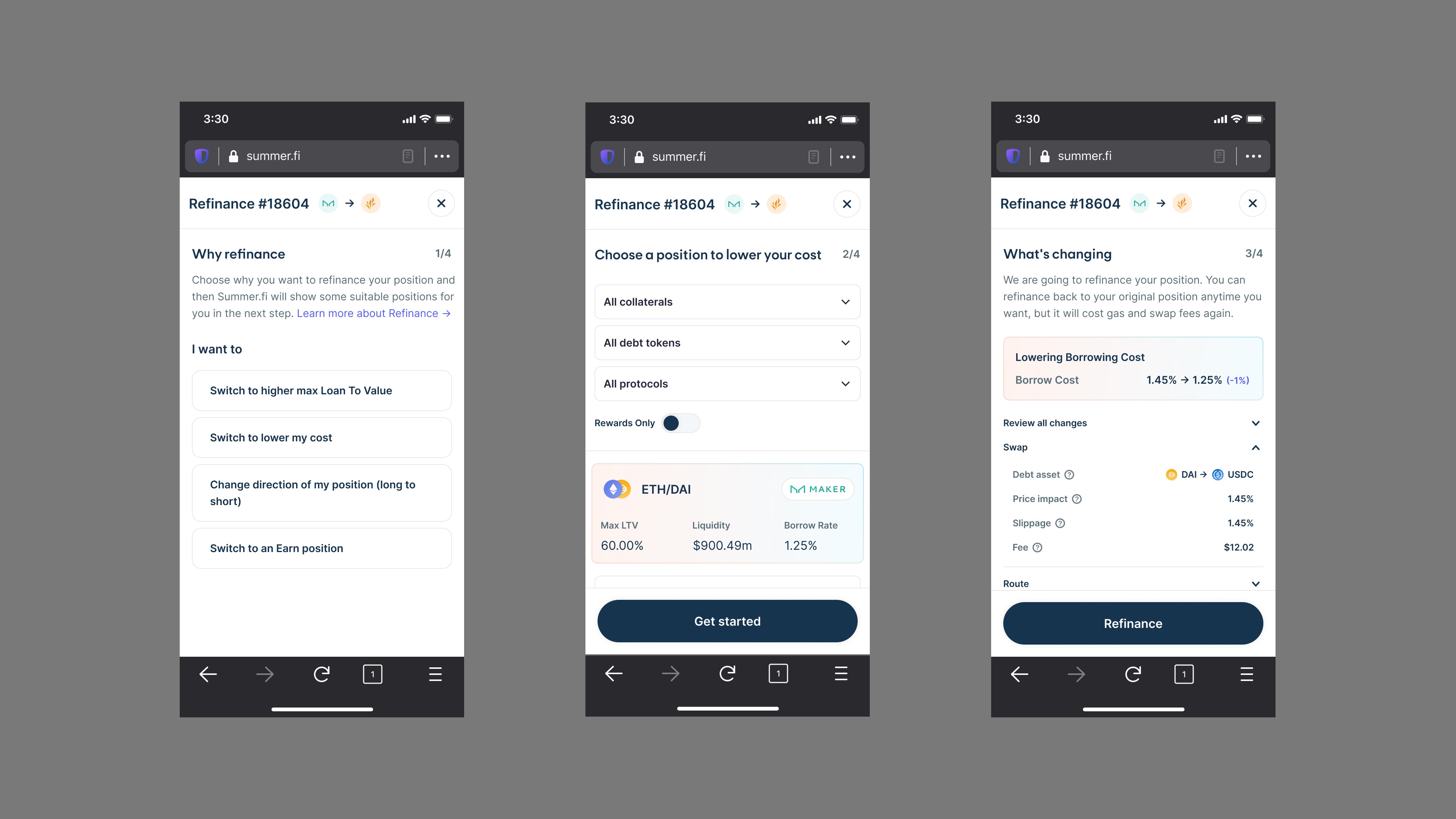
However, the modal has minimal space, and Summer.fi provides many positions for users to switch. A table with well-defined filters was a reasonable design option to display all options. In the first step, users can select the purpose of refinancing, and then the pre-filtered results are shown in the next step. Pre-filtering can also reduce the number of options and help users get started.
The screen below shows the result of lower borrow rate positions as users chose it in the 1st step. The table provides the crucial information that the user needs to consider before switching. The left sidebar shows the user's current position, making it easier to compare the existing and potential ones. Users can filter the result further by selecting collaterals, debt tokens, and protocols. More than that, we also have the user’s current position highlighted and fixed to the top of the table to make it easier to compare.

Once the user chooses a specific position, the 3rd step shows an overview of the critical changes in the refinance process, such as the Liquidation price, LTV, and Debt amount. The right sidebar also shows information about the new position.

Responsive design
Considering the small screen on mobile, we simplified the UI and only allowed users to do the basic interaction of Refinance.
Demo
Hazel Yang・ 2024 ⏐ Resume ・ X (Twitter)